What are ROC curves and how are these used to aid decision making?
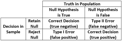
One of the most vexing challenges in all of statistics is the need to make a valid and reliable probabilistic assessment about some unknown condition or state of affairs based solely on information gathered from sample data. Indeed, this is the foundation of traditional null hypothesis testing: there is some unknown condition in the population (the null hypothesis is either true or false) and we must decide whether we believe the null hypothesis is true or false based solely on our sample data. There are thus four possible outcomes in which two decisions are correct (we reject the null when the null is false or we retain the null when the null is true) and two are incorrect (we reject the null when it is actually true or we retain the null when it is actually false). Type I Error is the probability of rejecting a null that is true, and Type II error is the probability of retaining a null that is false. This is commonly displayed in a traditional two-by-two table is the cornerstone of a frequentist hypothesis testing strategy that we all encounter every single day in our work.
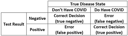
This same approach to decision making appears routinely in daily life. For example, we might want to know if a person referred to a clinic is likely to be diagnosed with major depression or not: they either are truly depressed or not (which is unknown to us) and we must decide based on some brief screening test if we believe it is likely that they suffer from depression. Or we might want to know if it is likely someone has a medical diagnosis that requires a more invasive biopsy procedure. Or, one that is near and dear to us all, we may want to know if we do or do not have COVID. There is a “true” condition (you really do or really do not have COVID) and we obtain a positive or negative result on a rapid test we bought for ten dollars from Walgreens. We have precisely the same four possible outcomes as shown above, two that are correct (it says you have COVID if you really do, or you do not have COVID if you really do not) and two that are incorrect (it says you have COVID when you really don’t, or you do not have COVID if you really do).
This is such an important concept that there are specific terms that capture these possible outcomes. Sensitivity is the probability that you will receive a positive rapid test result if you truly have COVID (the probability of a true positive for those with the disease). Specificity is the probability that you will receive a negative rapid test result if you truly do not have COVID (the probability of a true negative for those without the disease). One minus sensitivity thus represents the error of obtaining a false negative result, and one minus specificity represents the error of obtaining a false positive result. However, all of the above assumes that the rapid test has one of two outcomes: the little window on the rapid test either indicates a negative or a positive result. But this begs the very important question, how does the test know? That is, the test is based on a continuous reading of antigen levels yet some scientist in some lab decided that an exact point on this continuous antigen scale would change the test result from negative to positive. Determining this ideal point on a continuum is one of the many uses for ROC analysis.
ROC stands for receiver operating characteristic, the history of which can be traced back to the development of radar during World War II. Radar was in its infancy and engineers were struggling to determine how it could best be calibrated to maximize the probability of identifying a real threat (an enemy bomber, or a true positive) while minimizing the probability of a false alarm (a bird or a rain squall, or a false positive). The challenge was where to best set the continuous sensitivity of the receiver (called gain) to optimally balance these two outcomes. In other words, there was an infinite continuum of possible gain settings and they needed to determine a specific value that would balance true versus false readings. This is precisely the situation in which we find ourselves when using a brief screening instrument to identify depression or blood antigen levels to identify COVID.
To be more concrete, say that we had a 20-item screening instrument for major depression designed to assess whether an individual should be referred for treatment or not, but we don’t know at what specific score a referral should be made. We thus want to examine the ability of the continuous measure to optimally discriminate between true and false positive decisions across all possible cut-offs on the continuum. To accomplish this, we gather a sample of individuals with whom we conduct a comprehensive diagnostic workup to determine “true” depression, and we give the same individuals our brief 20-item screener and obtain a person-specific scale score that is continuously distributed. We can now construct what is commonly called a ROC curve that plots the true positive rate (or sensitivity) against the false positive rate (or one minus specificity) across all possible cut-points on a continuous measure. That is, we can determine how every possible cut-point on the screener discriminates between those who did or did not receive a comprehensive depression diagnosis.
To construct a ROC curve, we begin by creating a bivariate plot in which the y-axis represents sensitivity (or true positives) and the x-axis represents one minus specificity (or false positives). Because we are working in the metric of probabilities each axis is scaled between zero and one. We are thus plotting the true positive rate against the false positive rate across the continuum of possible cut points on the screener. Next, a 45-degree line is fixed from the origin (or 0,0 point) to the upper right quadrant (or 1,1 point) to indicate random discrimination; that is, for a given cut-point on the continuous measure, you are as likely to make a true positive as you are a false positive. However, the key information in the ROC curve is superimposing the sample-based curve that is associated with your continuous screener; this reflects the actual true-vs-false positive rate across all possible cut-offs of your screener. An idealized ROC curve (drawn from Wikipedia) is presented below.
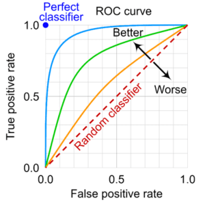
If the screener has no ability to discriminate between the two groups, the sample-based ROC curve will fall on the 45-degree line. However, that rarely happens in practice; instead, the curve capturing the true-to-false positive rates across all possible cut-points will lie above the 45-degree line indicating that the test is performing better than chance alone. The further the ROC curve deviates from the 45-degree line, the better able the screener is to correctly assign individuals to groups. At the extreme, a perfect screener will fall in the upper left corner (the 0,1 point) indicating all decisions are true positives and none are false positives. This too rarely if ever occurs in practice, and a screener will nearly always fall somewhere in the upper-left area of the plot.
But how do we know if our sample-based curve is meaningfully higher than the 45-degree line? There are many ways that have been proposed to evaluate this, but the most common is computing the area under the curve, or AUC. Because the plot defines a unit square (that is, it is one unit wide and one unit tall), 50% of the area of the square falls below the 45-degree line. Because we are working with probabilities, we can literally interpret this to mean that a there is a 50-50 chance a randomly drawn person from the depressed group has a higher score on the screener than a randomly drawn person from the non-depressed group. This of course reflects that the screener has no better than random chance of correctly specifying an individual. But what if the AUC for the screener was say .80? This would reflect that there is a probability of .8 that a randomly drawn person from the depressed group will have a higher score on the screener than a randomly drawn person from the non-depressed group. In other words, the screener is able to discriminate between the two groups at a higher rate than chance alone. But how high is high enough? There is not really a “right” answer, but conventional benchmarks are that AUCs over .90 are “excellent”, values between .70 and .90 are “acceptable” and values below .70 are “poor”. Like most general benchmarks in statistics, these are subjective, and much will ultimately depend on the specific theoretical question, measures, and sample at hand. (We could also plot multiple curves to compare two or more screeners, but we don’t detail this here.)
Note, however, that the AUC is a characteristic of the screener itself and we have not yet determined the optimal cut-point to use to classify individual cases. For example, say we wanted to determine the optimal value on our 20-item depression screener that would maximize the true positives and minimize the false positives in our referral for individuals to obtain a comprehensive diagnostic evaluation. Imagine that individual scores could range in value from zero to 50 and we could in principle set the cut-off value at any point on the scale. The ROC curve allows us to compare the true positive to false positive rate across the entire range of the screener and estimate what the true vs. false positive classification at each and every value of the screener. We then can select the optimal value that best balances true positives from false positives, and that value becomes are cut-off point at which we demarcate who is referred for a comprehensive diagnostic evaluation and those who are not. There are a variety of methods for accomplishing this goal, including computing the closest point at which the curve approaches the upper-left corner, the point at which a certain ratio of true-to-false positives is reached, and using more recent methods drawn from Bayesian estimation and machine learning. Some of these methods become quite complex, and we do not detail these here.
Regardless of method used, it is important to realize that the optimal cut-point may not be universal but varies by one or more moderators (e.g., biological sex or age) such that one cut-point is ideal for children and another for adolescents. Further, the ideal cut-point might be informed by the relative cost of making a true vs. false positive. For example, a more innocuous example might be determining if a child might benefit from additional tutoring in mathematics compared to a much more severe determination of whether an individual might suffer from severe depression and be at risk for self-harm. Different criteria might be used in determining the optimal cut-point for the former vs. the latter. Importantly, this statistical architecture is quite general and can be applied across a wide array of settings within the social sciences and offers a rigorous and principled method to help guide optimal decision making. We offer several suggested readings below.
Suggested Readings
Fan, J., Upadhye, S., & Worster, A. (2006). Understanding receiver operating characteristic (ROC) curves. Canadian Journal of Emergency Medicine, 8, 19-20.
Hart, P. D. (2016). Receiver operating characteristic (ROC) curve analysis: A tutorial using body mass index (BMI) as a measure of obesity. J Phys Act Res, 1, 5-8.
Janssens, A. C. J., & Martens, F. K. (2020). Reflection on modern methods: Revisiting the area under the ROC Curve. International journal of epidemiology, 49, 1397-1403.
Mandrekar, J. N. (2010). Receiver operating characteristic curve in diagnostic test assessment. Journal of Thoracic Oncology, 5, 1315-1316.
Petscher, Y. M., Schatschneider, C., & Compton, D. L. (Eds.). (2013). Applied quantitative analysis in education and the social sciences. Routledge.
Youngstrom, E. A. (2014). A primer on receiver operating characteristic analysis and diagnostic efficiency statistics for pediatric psychology: we are ready to ROC. Journal of Pediatric Psychology, 39, 204-221.